Catalyst Blog
Featured Post

Understanding Magisk and the Shamiko Module: Unpacking Claims of Bypassing Digital.ai’s Android Security
Discover the capabilities of Magisk and its modules. Explore functionality, integration, security implications, Shamiko, and app hardening solutions.
SEARCH & FILTER
More From The Blog
Search for
Category

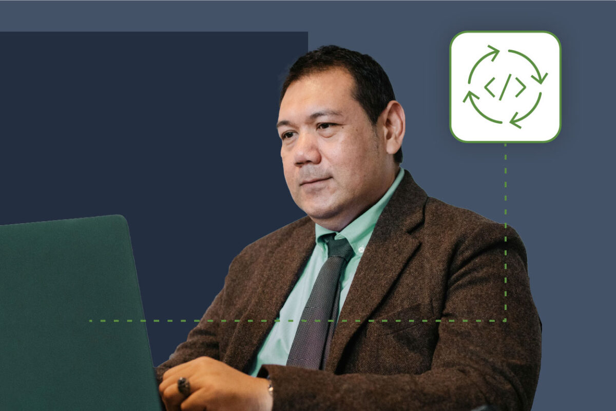
Guide: Mobile Automation with Appium in JavaScript
Learn to automate mobile apps with Appium and JavaScript. Our guide includes setup, test writing, and advanced features to streamline your testing process.

Digital.ai and Packaged Agile Partner to Help Enterprises and Agencies Reclaim the Value of Agile
Digital.ai and Packaged Agile: A Strategic Partnership That Reconnects Agile Delivery with Real Business & Mission Outcomes to be More Efficient & Effective
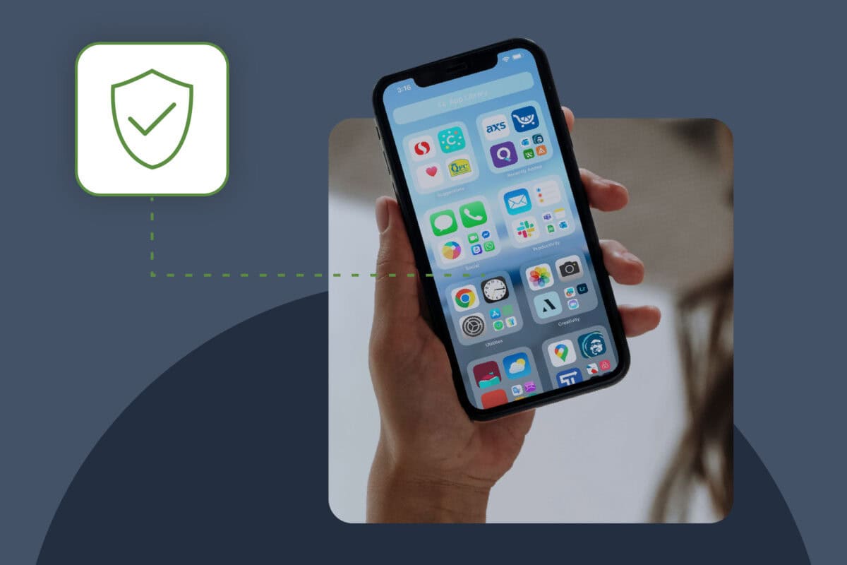
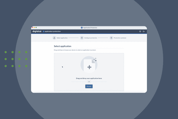
Announcing Quick Protect Agent: MASVS-Aligned Protections, Now Easier Than Ever
Easily apply OWASP MASVS-aligned protections to your mobile apps—no coding needed. Quick Protect Agent delivers enterprise-grade security in minutes.
Digital.ai Testing Now Supports iOS 26 Beta
Digital.ai Testing now supports iOS 26 (Beta). Discover the new features and see how it works with a demo below.

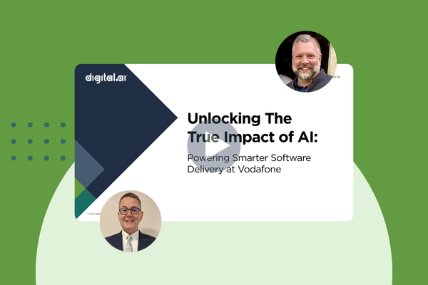
Beyond Automation: How AI is Transforming Enterprise Software Delivery
Discover how AI in software delivery is revolutionizing enterprise software by automating tasks, enhancing UX, and transforming the SDLC.
A Good Tailor Makes the App: Unlocking Continuous Testing with Custom Cloud Deployments
Unlock the power of tailored continuous testing with custom cloud deployments from Digital.ai. Boost speed, security, and quality for enterprise software teams.

Navigating the AI Revolution: Digital.ai’s Vision for Enterprise Software Delivery
Discover how Digital.ai’s pragmatic approach to agentic AI helps enterprises balance innovation, transparency, and measurable outcomes in software delivery.

Boldly Expanding Testing’s Reach with Shared Devices
Discover how a library-inspired approach to testing with shared devices helps teams expand coverage, improve quality, and streamline software delivery at scale.
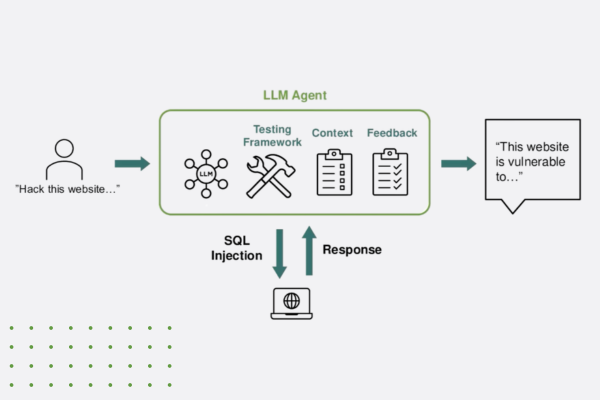
“Think Like a Hacker” Webinar Recap: How AI is Reshaping App Security
Discover how generative AI is reshaping app security—empowering both developers and hackers. Learn key strategies to defend against AI-powered threats.